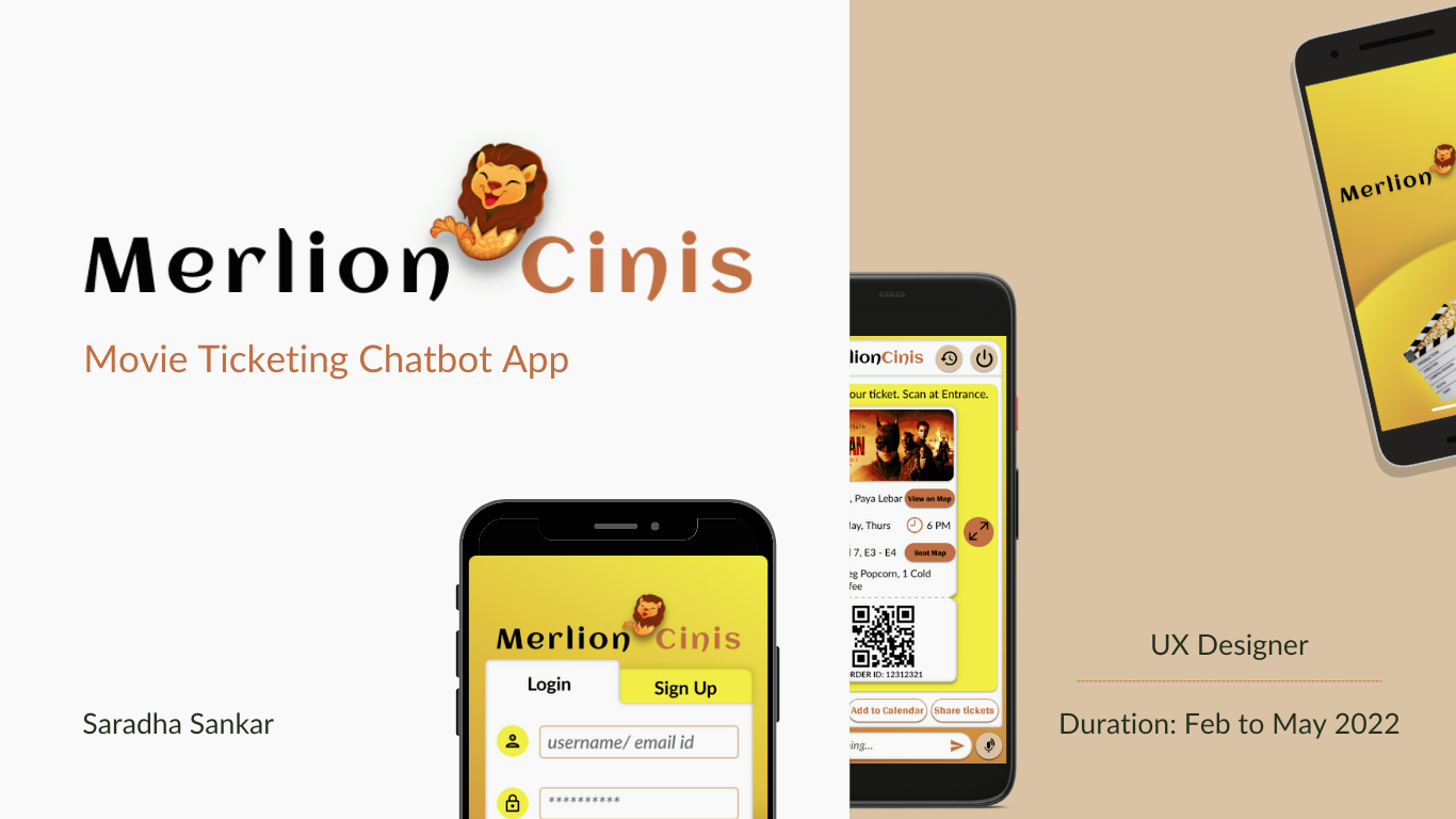
Project Overview
The Project
Merlion Cinis, Singapore’s leading cineplex offers movie-goers, a complete experience with its widest variety of new and upcoming movie releases with unrivalled cinematic experiences using state of the art technology and carefully curated food & beverages in all its theatre chain.
The Problem
Busy individuals and family movie lovers, needing on the go intuitive personalized movie booking experience with quick support and no hidden costs to relax and enjoy the movie at comfortable timings and seats after long tiring workdays.
The Goal
Design chatbot app that lets users quick book movies of their choice at ease by leveraging their preferences and past experiences to provide a personalized hassle-free movie experience with voice assistance, quick support.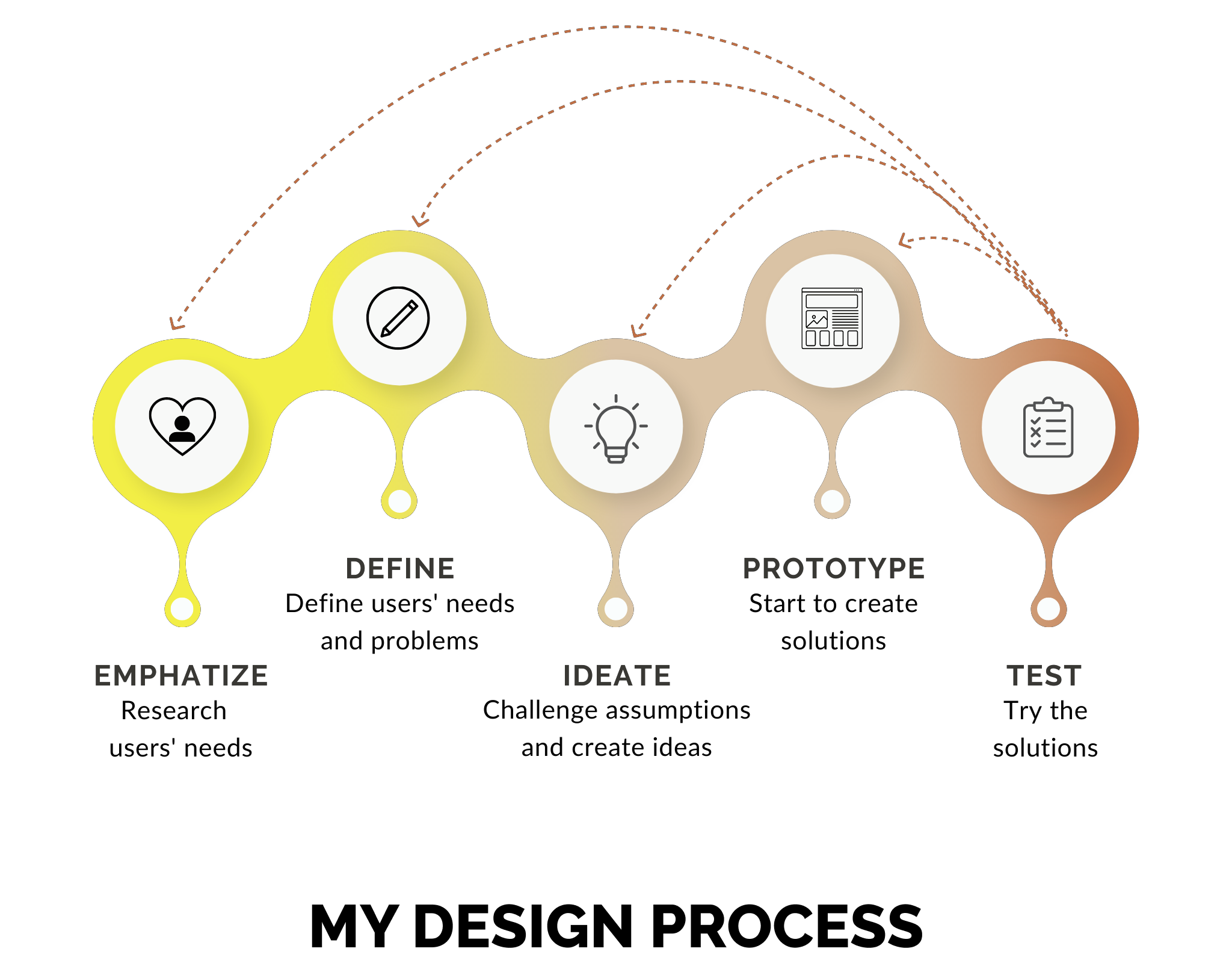
My Role
UX Designer of Merlion Cinis from conception to delivery.
Responsibilities
Conducting surveys, interviews, competitive audit; creating user persona, storyboards, paper and digital wireframes, low and high fidelity prototypes, conducting usability studies, accounting for accessibility and design iterations basis insights.
Understanding the User
User research: Summary
I conducted 8 interviews and 17 surveys to get an understanding of the audience I am designing the chatbot movie ticket booking app for and their needs, behaviour and pain points.
I created empathy maps and user stories using the primary research data and was able to break it down into 2 personas out of which the primary user group was frequent movie goer looking for a prioritized personalized experience.
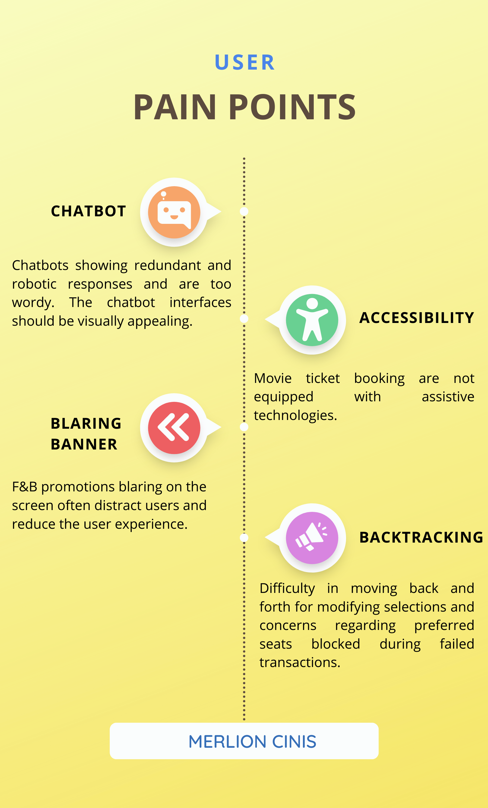
They also felt that the responses are redundant and are not quite useful and specific to the questions they had. They also had issues with the F&B listing, blaring banners, blocking preferred seats etc and wanted a premium personalized experience.
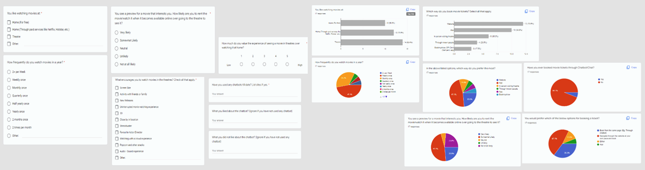 Survey Snaps
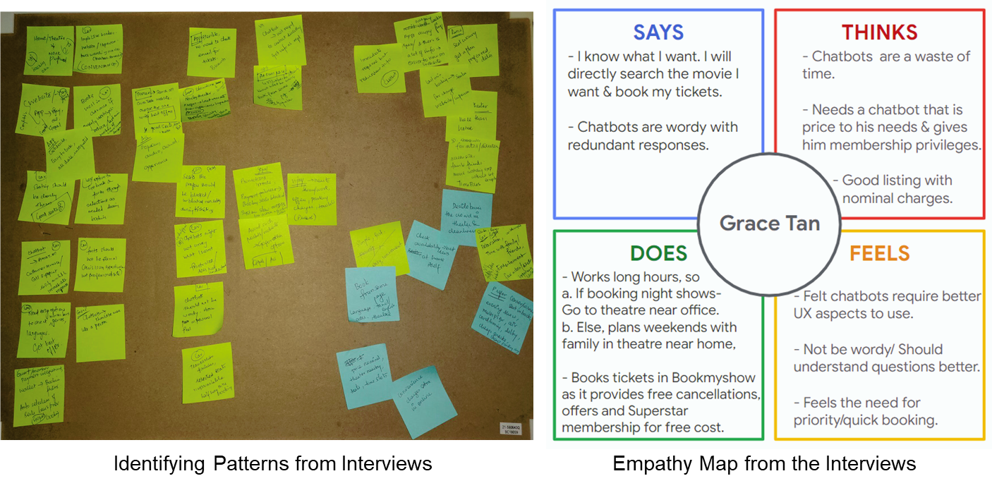
Meet the users:
My 2 personas for Portfolio project on movie ticketing chatbot:
1. A frequent movie goer looking for a prioritized personalized experience
2. A less tech savvy person/ older people who prefer simple and easy booking experience.
Basis the interviews and survey with people across diverse background, I was able to cluster the users into 2 complete personas of similar ideas, goals and pain points.
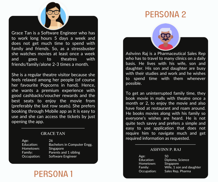
I chose to work with Persona 1 and provide a design solution for their needs. Below are the User story, problem statement generated specifically for the Persona 1 basis their goals, motivations and pain points.
User Story:
As a regular movie goer, I want to have a personalized, quick & intuitive ticket booking experience with good offers, quick payment options, wide spread food choices, quick customer support and the best seats at my preferred time near my workplace/home, so that I can feel valued & have a relaxed, uninterrupted movie experience that dilutes my stress.
Problem statement:
Grace Tan, a busy professional is a movie freak who needs an on the go quick personalized movie booking experience because she wants to relax and enjoy the movie at comfortable timings and seats after long tiring workdays.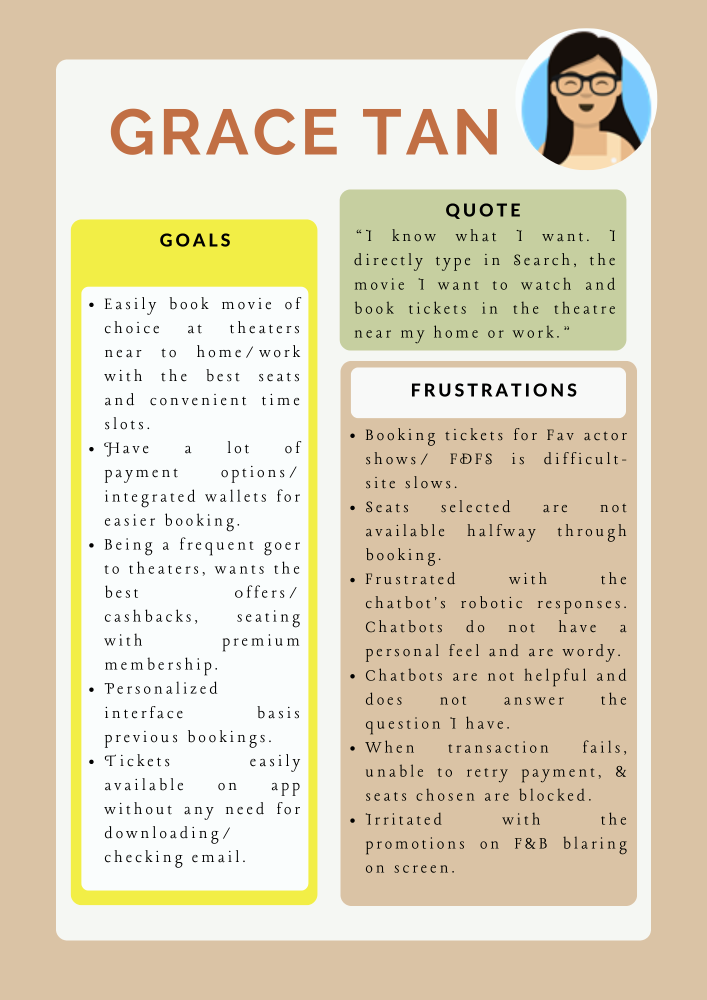
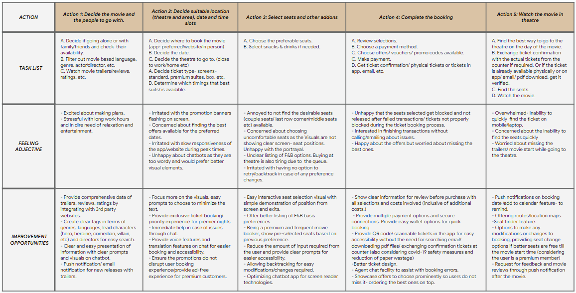
Mapping User Journey:
Goal: Enjoy easy and premium movie ticket booking experience.Mapping Grace’s journey helped reveal the areas of design and accessibility improvements required at each step of their journey and how a chatbot can be designed to provide a personalized experience.
Competitive Audit:
Competitors were analyzed in terms of features, accessibility, value proposition etc to determine gaps and opportunities. Below are a few snippets of the same.
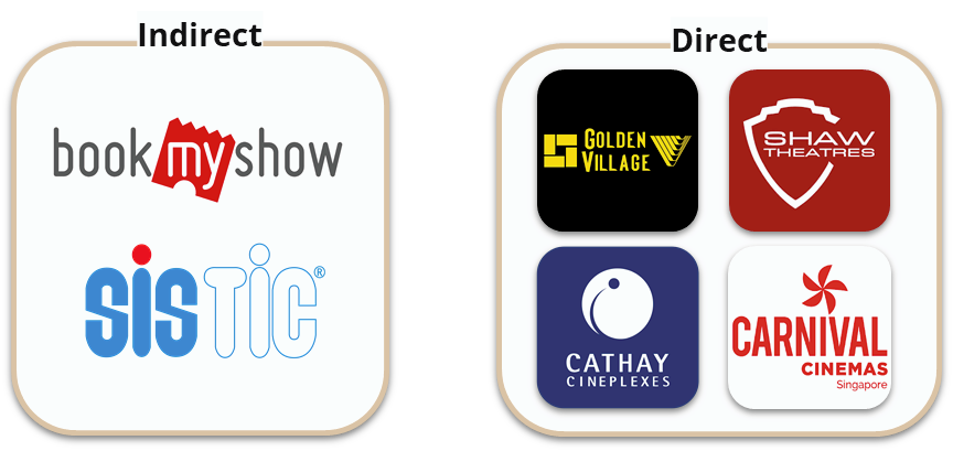
Gaps
- Focus on a few accessibility factors like wheelchair friendliness, screen reader accessibility etc
- Personalized offering / loyalty programs missing
- Quick chat support and chatbot booking experience missing. Cathay has a chatbot but is wordy and less visual focused.
- Feedback loops (reviews) missing in all except for Golden Village.
- Pre-filled user data and past payments are missing in few competitors.
- Content is mostly in English with no translation facilities except for Bookmyshow and Sistic.
- Seat count was not selectable in most apps.
- Backtracking is difficult / confusing in most apps.
Opportunities
- Visually interactive and less wordy chatbot for engagement and quick support.
- Clear tagging basis languages, genres, venue/location, etc. Reviews, clear cast information, Amenities listing, seat finder for cinemas.
- Loyalty programs for regular users, 1 step payment options, wallet and quick saveable payment methods.
- Promote local language accessibility. Screen Reader friendly.
- Continued experience / retry from the last point of issue in case of system crash or transaction failure.
- Clear Seats view with exits, screen position, wheelchair friendly seats information and routes, preselected best seats.
- Easy modifications until 2 hours before booking and backtracking while booking.
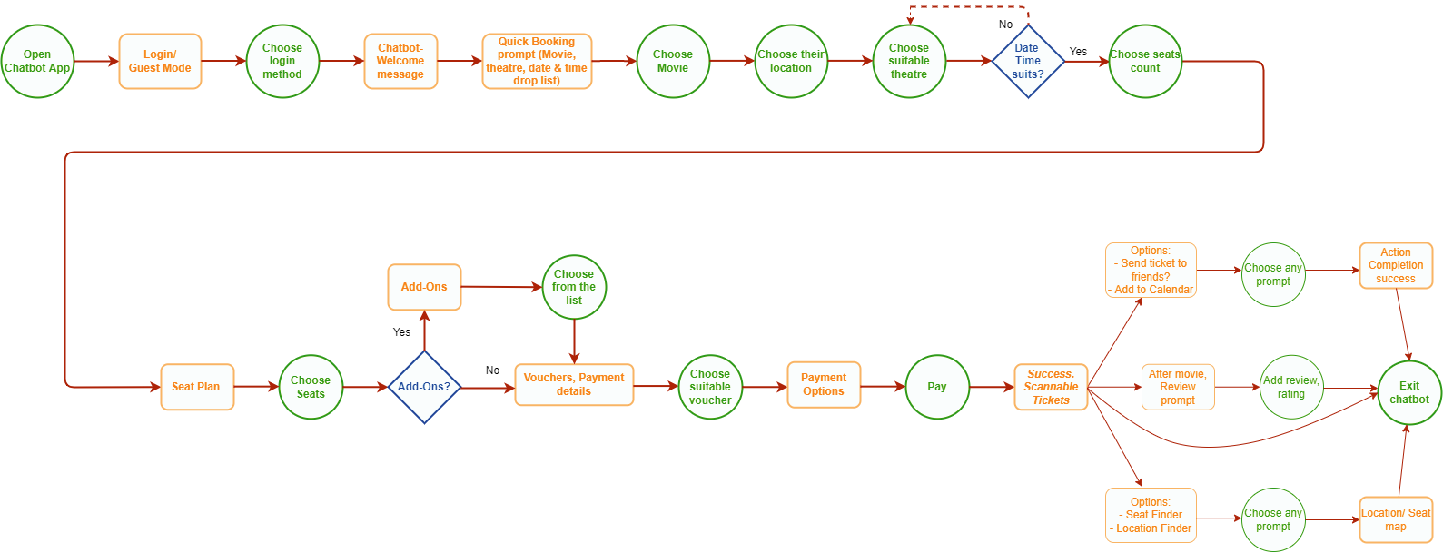
User Flow
The user flow shows the overall movie chatbot app with its 4 flows- Quick Booking, Start with movie selection, start with cinema selection or start with the date & time of preference.
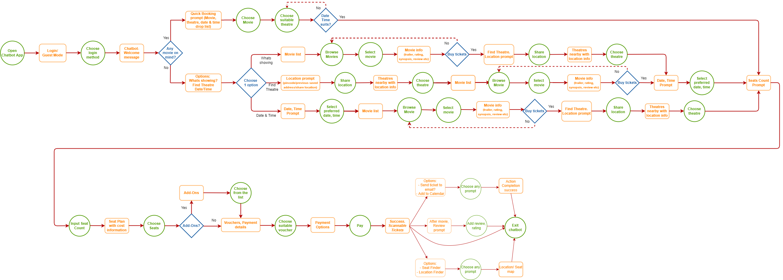
Quick Book User Flow
The main focus was the quick booking mode which solves the concerns of regular movie goers who book on the go.
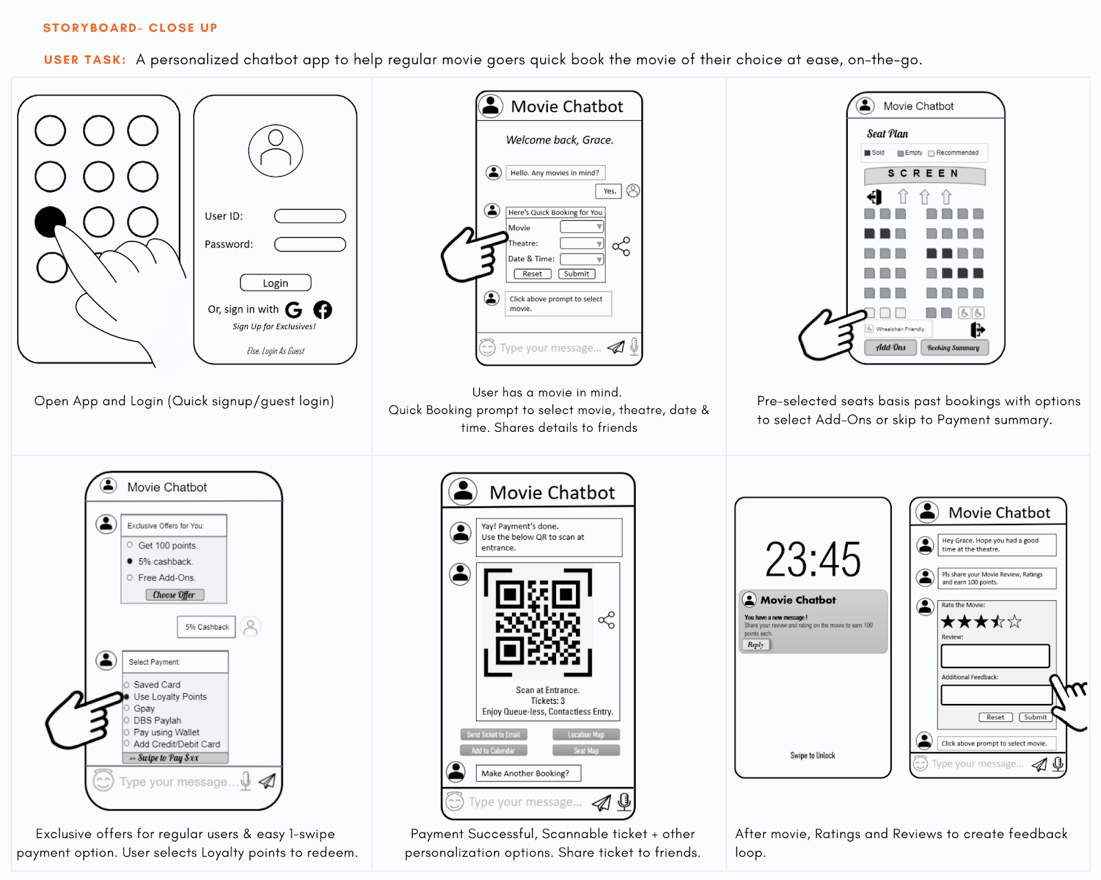
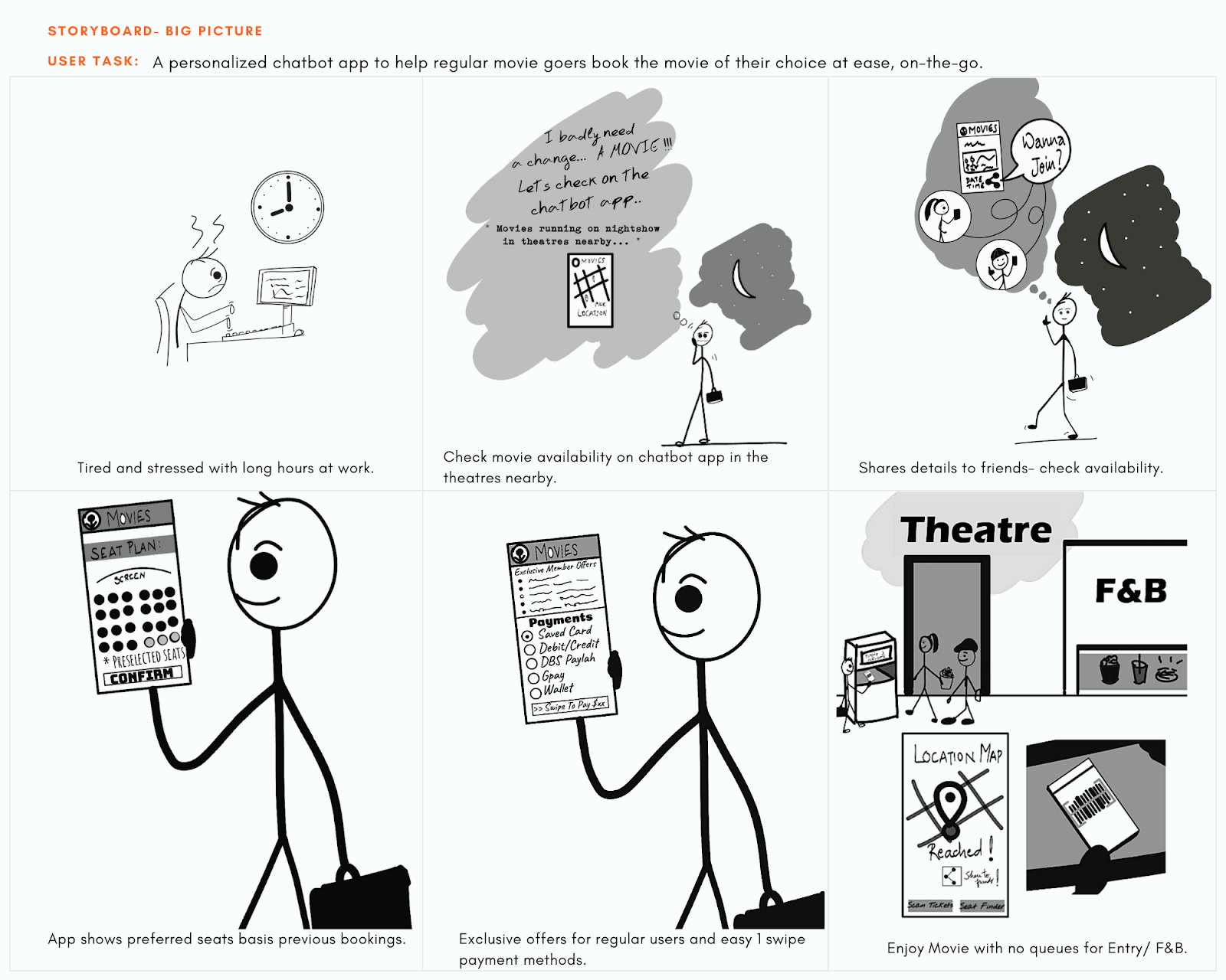
Story Boards
Basis the persona and user journey, storyboards were created with a closeup as well as big picture view.
Starting the design
Paper wireframes
By creating multiple iterations for each screen on paper, I was able to ensure that the elements that made it to the Digital Wireframe are well-suited to give a personalized experience.
The Quick Booking screen was designed with focus on the frequent movie goers who already have an idea of what they want, to choose all essential options from the same screen quickly.
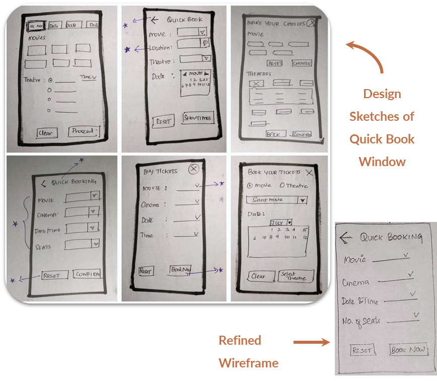
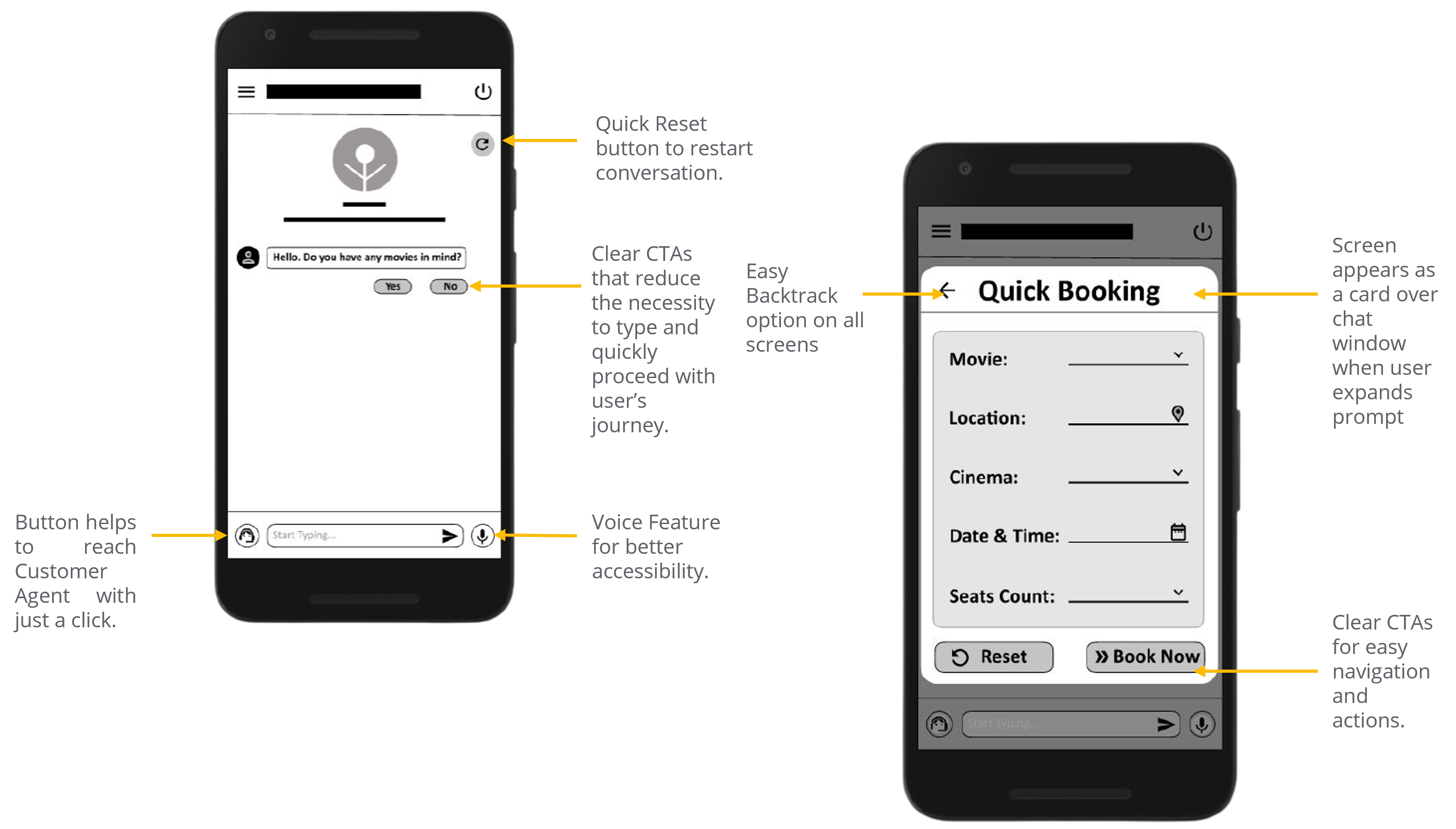
Digital Wireframes
As the initial design phase continued, I ensured that the user pain points, goals, feedback are incorporated in the design. The chat window has the quick Customer Care, Reset, logout, voice feature, clear CTAs for easier accessibility.
Easy Backtracking, navigation, screen reader friendliness and personalization basis user preferences where few of the main focus in the design. Quick Booking feature includes location feature to personalize cinema listing basis nearness, seats count to showcase recommendations and quicker seat selections.
Low Fidelity Prototype
The low-fidelity prototype showcases 4 movie booking flows basis user needs-
1. Quick Booking flow for users
who already know what they are going to book, and
2. 3 flows basis their browsing preferences- Movies/ Cinemas/
Showtime.
You can view the overall Low-Fidelity Prototype design here: Low-fidelity prototype.
Usability study
I conducted 2 rounds of Moderated Usability Studies followed by System Usability Scale with 6 participants (including 2 participants using visual aids like screen reader, magnified screens and 1 not comfortable with English language). Findings from the first Usability Study helped guide improving the design of mockups and the low fidelity prototype and the second Usability Study done on High Fidelity Prototype revealed aspects that required refining.
Research goals
- Determine if the chatbot app is easy to use.
- Determine if the chatbot is able to provide the relevant information the user is looking for, with very few user interactions.
- Determine if the user flow created in the prototype does not match the user needs.
- Determine if any essential aspect/feature is missing in the design.
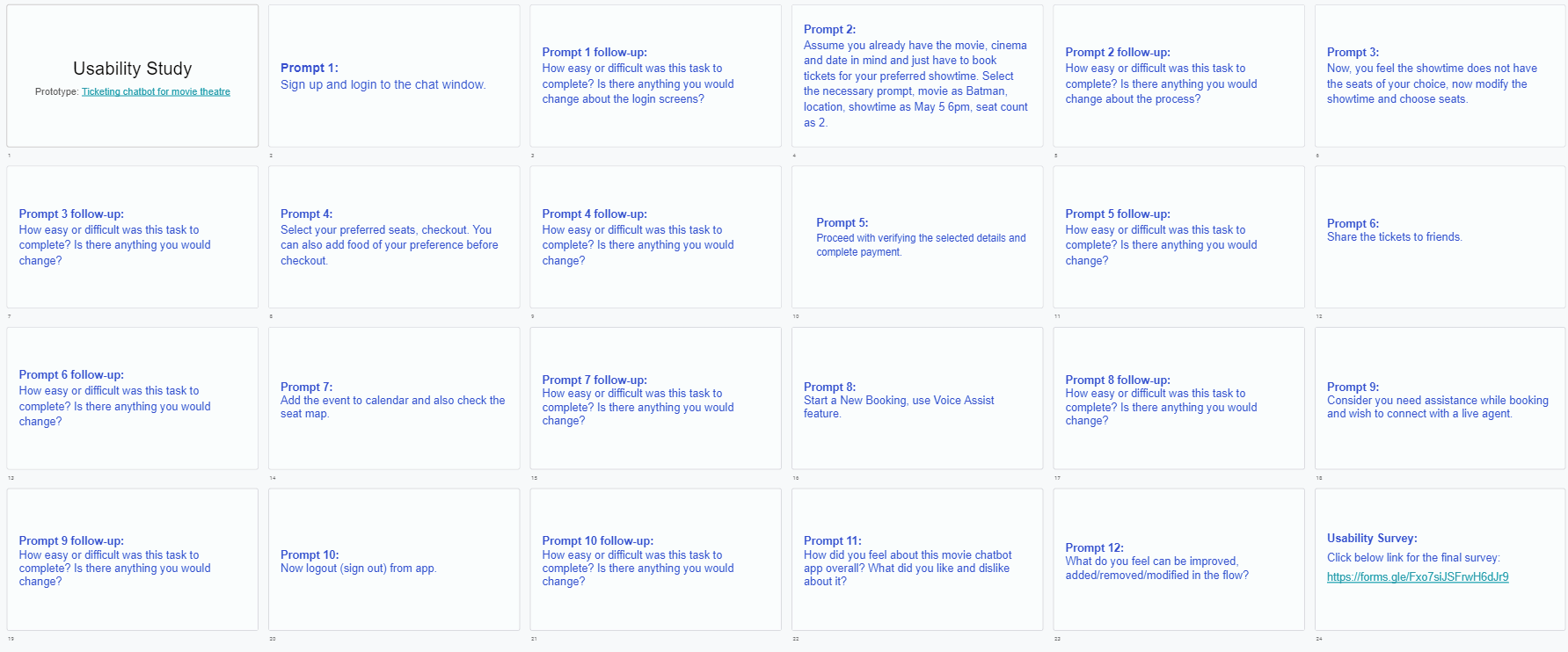
Snap of the Prompts
Research Questions
- Figure out if users can complete the core task within the app.
- How long does it take a user to find and book movie tickets on the app?
- What can we learn from the user flow- the steps taken by users to book movie tickets?
- What personalization aspects/features that user expects from the movie ticketing app are missing in design?
- Any hurdles the user faces while booking? Are there any parts where the user gets stuck?
- Are users able to share tickets and movie plans to friends easily?
- Figure if any part of the flow needs modification or is unnecessary.
- Do users think the app is easy or difficult to use
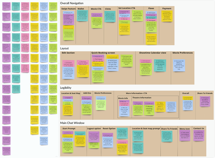
Affinity Diagram - Round 1
Round 1 findings - Research
- Accessibility concerns over jargons like Add-Ons, Format etc.
- Users found the showtime selection difficult on the calendar design.
- Users felt the need for less CTAs to avoid confusion. Integration of setting location within Home/Work CTAs, seat map, location map within ticket.
Affinity Diagram - Round 2
Round 2 findings - Research
- Users wanted clear indication of scroll-ability feature in drop-lists.
- Users had difficulty selecting the Food & Beverages as they did not notice the Add button at the bottom of the image.
- Users felt the edit (back) option takes more clicks than necessary for modifying seats/food.
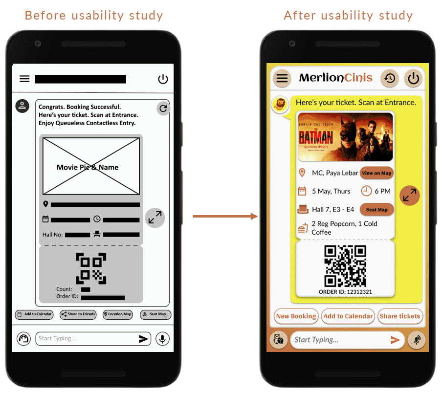
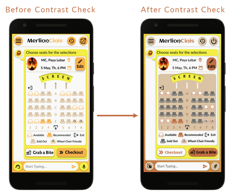
Refining the design
The usability study revealed the inability of users to see the scroll feature available for selection drop lists and food items and the inability of few users to read the description text on drop downs. Also, the patterns showed the need for easier icons on main window.
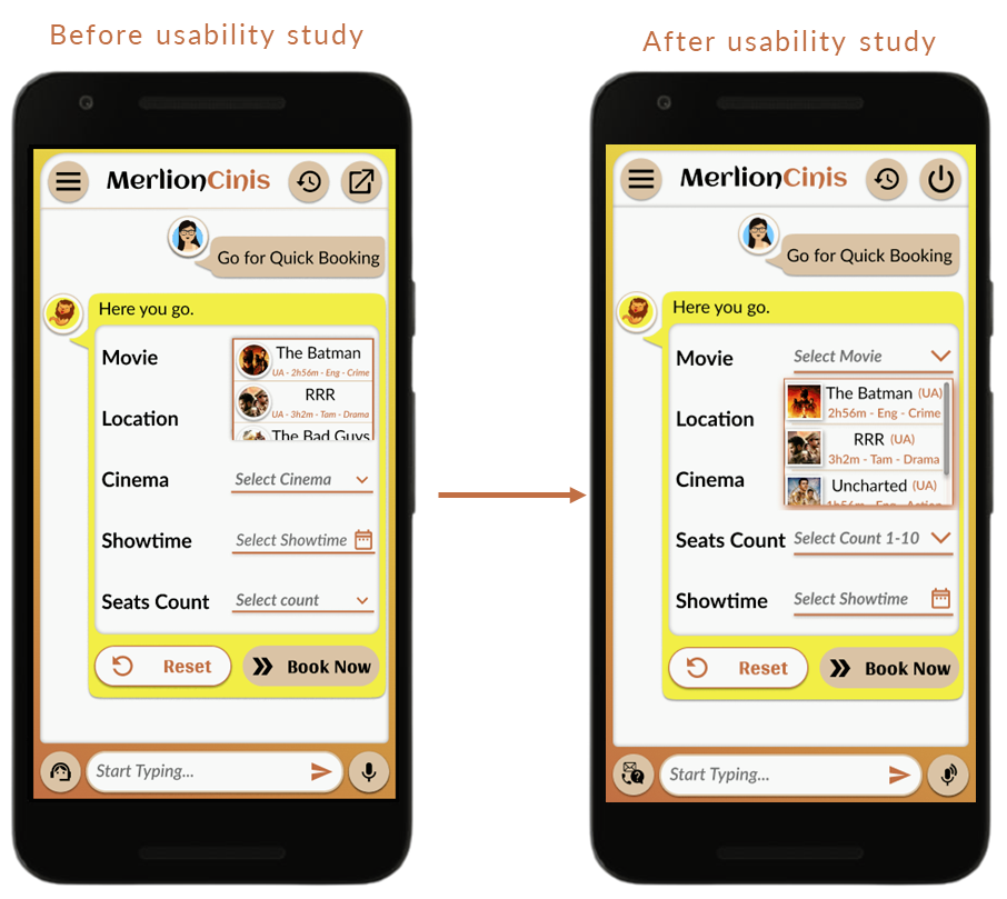
During initial usability study, identified users preferred lesser options to choose from to avoid confusions. The location, seat map were separate CTAs which were then integrated to be part of the ticket for easier accessibility in terms of functionality as well as readability.
Key Mockups
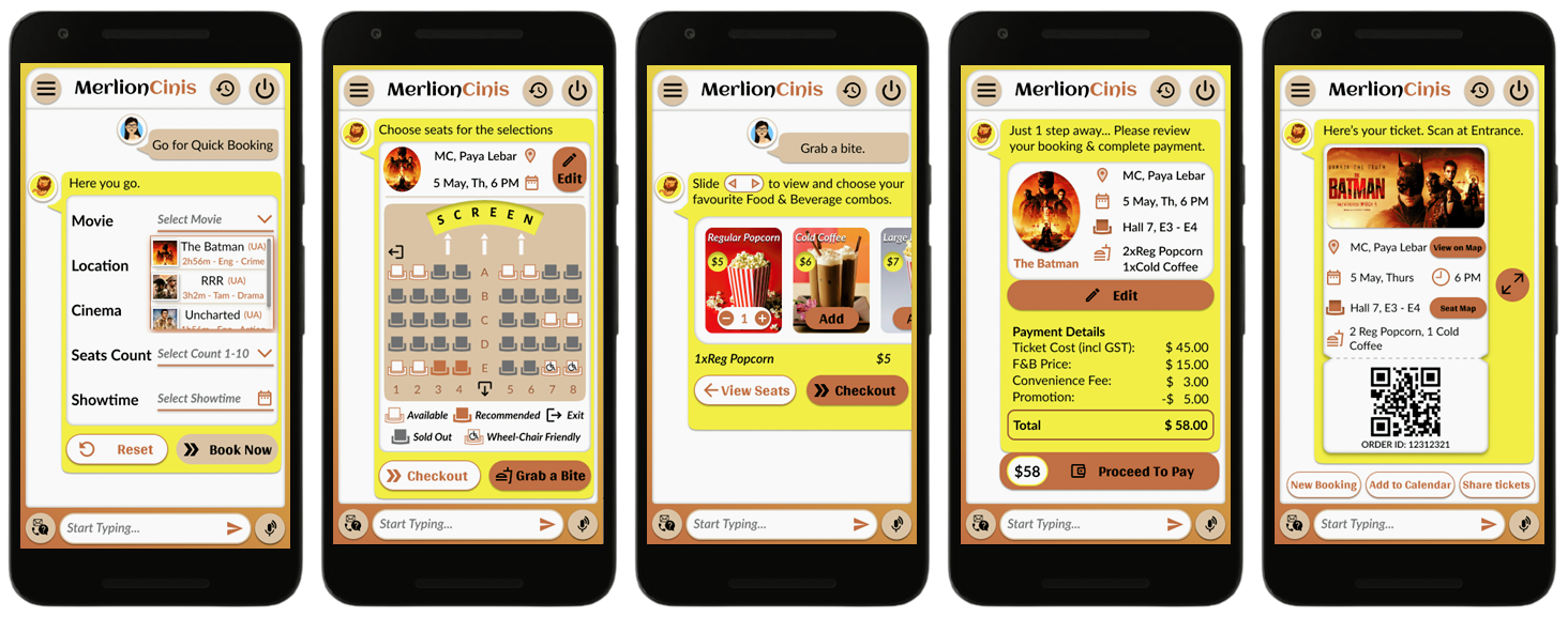
High Fidelity Prototype
The final high-fidelity prototype showcases Quick Movie Booking flow the user needs along with easy accessibility in terms of quick customer support, voice assistance, backtracking in a personalized chatbot experience with recommendations in terms of nearby cinemas, preselection of best seats, and more.
Here is the link: High-fidelity prototype.
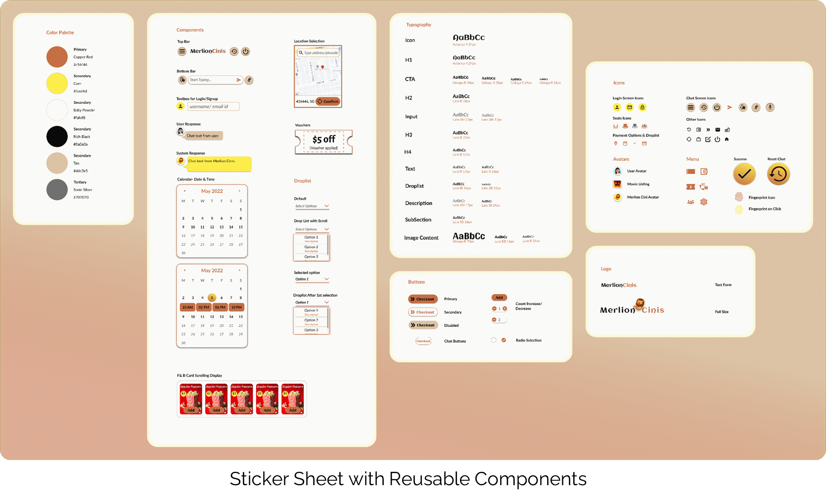
Design System
At the initial phase of Hi-Fi Prototype, the reusable components- Colors, Fonts, Buttons etc were created as a Sticker sheet for future use when expanding the design.
Going Forward
Impact
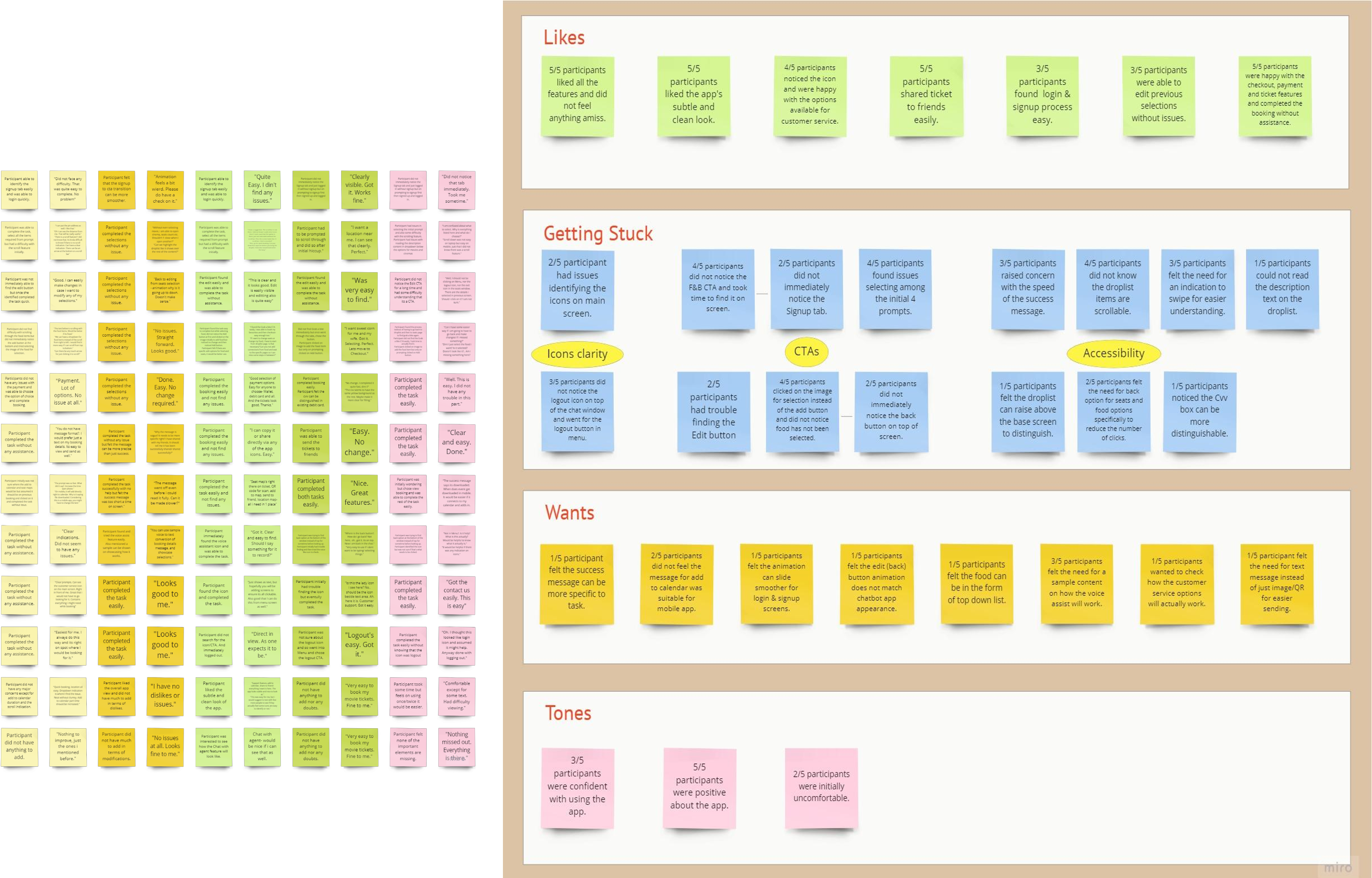
The app made users feel valued with the personalizations and the clean intuitive design. Also, the patterns showed the need for easier icons on main window.
"Quick booking, option to type pincode, share to friends- the features i really wanted. The app looks neat with clean visuals."
“Support feature, add to calendar, share to friends- everything I want is here. The app looks subtle and nice to look at."
What I learned:
I learned how keeping the users at the forefront can help with the design thinking from the initial raw ideas to a refined prototype.
I became more open for feedback over the process of interviews, usability tests, peer reviews. The project helped me focus on aligning the product with the brand image.
Next Steps
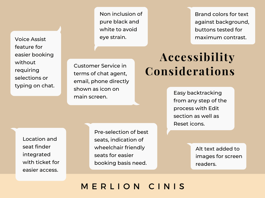
- Expand on the customer service screens with FAQs screens, chat assistant feature screen designs to increase accessibility.
- Movie time alert, After movie review notification for user reviews with awards can help with app engagement.
- Conduct more user research focusing on accessibility to identify new areas of need. Also design the remaining 3 flows from low fidelity design with deep filter/search, movie details along with user reviews.
- Feasibility study of Text/ email booking confirmation. The focus of the design was a shareable single ticket with all details integrated. But usability study revealed the need for booking confirmation via mail/phone.
Let’s connect!
Thank you so much for the time you have taken to read through my design process. If you’d like to get in touch with me, please reach out to me via:
Looking forward to hearing from you !